;)
One of the challenges in Operations Manager is providing an effective way to visualize information which does not require a significant amount of overhead from the Operations Manager administrator to implement or maintain. A common example of this is a free disk space dashboard or report. There are a variety of methods currently available to visualize this type of data but each of them has their own positives and negatives. This blog post will cover a variety of topics including methods to visualize this type of data in Operations Manager and will investigate Power BI and a simple example of how it can be leveraged to provide this type of functionality.
The sections of this blog post include:
- Visualizing disk space information using Operations Manager, OMS and 3rd party solutions
- Why Power BI?
- Starting with Power BI
- Getting data into Power BI
- Developing a simple report or dashboard
- Breaking down how the sample was built
Visualizing disk space information using Operations Manager, OMS and 3rd party solutions:
There are a variety of methods to display free disk space for systems in Operations Manager. These include:
- Microsoft includes some excellent pre-built dashboards and views which provide visualization for disk space conditions. An example from the Disk Capacity view within the Microsoft Windows Server management pack is shown below.
- Microsoft has two reports which assist with showcasing KPI’s for your servers including processor, disk, network and memory: Performance by System and Performance by Utilization. These are available in the Windows Server Operating System Reports management pack through the Performance by System and Performance by Utilization reports. A small sample is shown below.
- Community provided reports: There is a well written community report which provides free disk space for both Windows and Unix systems. I blogged on this previously here.
- Operations Manager custom dashboards: You can also visualize free disk space directly in Operations Manager through the built-in dashboard functionality and create your own custom dashboard for free disk information.
- Building your own report: Building one of these in Operations Manager hasn’t been simple but it still works.
Microsoft OMS also provides a solid method to display free space for systems. I blogged on this at: [CSF]
There are a variety of 3rd party vendors which can display free disk space for systems in Operations Manager. These include: (ordered by when they arrived in the market)
Why Power BI?
Power BI is an interesting choice as it makes it easy for someone who is not a databases focused SME to gather data and visualize that data. Additionally, you can choose what data you want your users to have access to, and they can develop their own reports or dashboards using an intuitive visualization experience.
Starting with Power BI
Power BI is available as a cloud based user experience from https://powerbi.microsoft.com (sign-in in the top right corner). Additionally there is a Power BI desktop client which you can download. To gather data from my Operations Manager DW the first step I took was to install the Power BI desktop client. For simplicity I installed this on the server which contained my OperationsManagerDW database. Installation was straight forward so the next step was to connect the desktop client up to my OperationsManagerDW database (please note, you can also connect to the OperationsManager database but that is not a recommended practice).
Getting data into Power BI
Once the desktop client is installed, the next step is to go get some data. In this case we want to choose “SQL Server Database”.
Next we point to the Operations Manager Data Warehouse (use the fully qualified name of the database server).
Specify credentials which have access to the data warehouse.
Next we need to choose our tables. This is the part that can be confusing if you aren’t familiar with the OperationsManagerDW.
The goal for my first Power BI report or dashboard is to show disk space information which I know is stored as a performance counter in Operations Manager. To do this we want to add the ManagedEntity table (which translates object numbers to their names – critical for what we want to do). Additionally, I want the underlying performance information which is stored as Raw, Hourly and Daily information.
If you are unfamiliar with the table structure, the option to “Select Related Tables” may be helpful. In my example this provided a total of 14 tables which were related to what I was looking for.
Please note, choosing what to query out of a source like the OperationsManagerDW is where most of the actual work will occur based on what I have learned since starting with this blog post. For future iterations such as reports which only show the most recent free disk space I would only want to return the counters specific to free disk space and only the most recent value for those counters. For this example blog post however, returning all performance data provides an insight into the variety of information which is available in the OperationsManagerDW database (IE: Every performance counter that OpsMgr gathers, including those gathered by 3rd party management packs!)
Developing a simple report or dashboard:
For me the toughest part of learning how to use Power BI up to the level I have so far is the first screen. We have data now (whoho!) but how do we actually do something with it? You start out with a data set on the left, a blank middle screen and the visualization and fields information shown below (all screenshots in this section are from the web version of Power BI).
The first place to start is with the “slicer” which his shown selected below.
The slicer lets us go through the data that we have and pick out what we want to show. From the fields we add the Path from vManagedEntity which shows us all entities from our set of data.
The slicer with a Path field added is shown below.
We want to filter on the name, so we drag the name field onto the filters.
And then we use Advanced filtering. Since I did not select the specific data that I was looking for (I gathered all performance information from the OperationsManagerDW) I now want to filter this data down to just the disk related counters.
By choosing the advanced filter I can now specify any objects which contain C: or D:
This now filters the content shown in the Slicer.
From there I can add visualizations such as a line chart.
And then I can choose the fields to display in that line chart.
The results in the line chart now automatically filtered to the objects that I choose in the slicer. It’s pretty simple once you get used to it! The example below shows a single system chosen in the slicer.
Breaking down how the sample was built:
The sample which I built is shown below. It includes a slicer, a clustered column chart, a card, and a line chart on the bottom. As I select different objects the different views adapt.
The example below shows this same view with different data selected (just the C drives from three of my servers). The line chart shows the average disk space averaged over the three C drives which are selected.
My configurations are shown below.
First for the slicer – we add the FullName and filter it on fields which contain ;c: or ;d:.
The clustered column chart includes the AverageValue from vPerfHourly, the Fullname from vManagedEntity and the Path from vManagedEntity. The title and other configurations were set using the paintbrush object highlighted below.
The card was configured using the FullName from vManagedEntity and a custom title was configured.
The line chart was configured with the AverageValue and DateTime information from vPerfHourly.
For additional interesting reading on this topic I recommend looking at the following:
Summary: Power BI introduces some extremely flexible methods to visualize data from a variety of sources including databases such as the OperationsManager DW. I highly recommend checking out Power BI and seeing what it can do for you at https://powerbi.microsoft.com/. I owe a huge thank you to Dieter Gasser for his introduction and walk through for how to use Power BI!
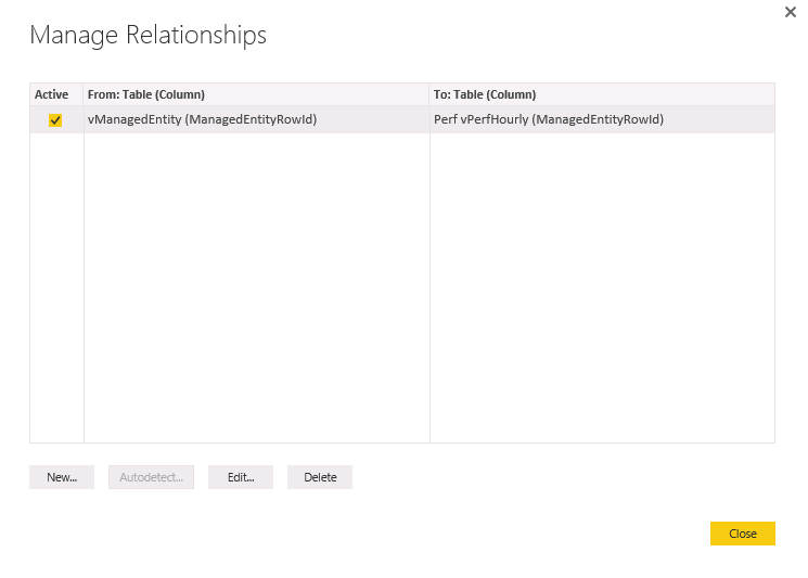
Update: I received the following feedback that I had missed a step on this process which if it is not done you do not get the relationship between the slicer and the chart. Details are provided below:
- You have to click on the “Manage Relationships” button and create a relationship between the vManagedEntity table and the perf table you want to pull from. (such as Perf vPerfHourly). Once you establish the relationship then the chart and slicing works.
- If this isn’t done, then the chart that you see will show the aggregated data from all of your drives…even if nothing is selected.